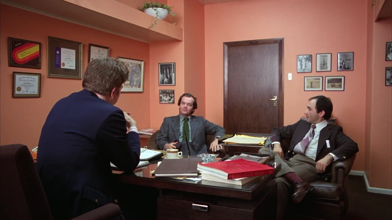
Too jarring (and … too much of a Kubrick film) to chalk it up to bad style, there are a few instances where the visuals clash.
Striped chairs are placed next to plaid chairs, but this is tame compared to other examples.
In Watson’s case in No.5, he wears a cacophony of things that do not match. Jack is minimal in grey and green and Watson wears clashing plaids, browns and burgundies.
In The Gold Room’s case, bright red and garish gold clash loudly with the pink and soft yellows— and the real gold that tiles the walls.
Clashing visuals mean to pay attention: that the information you’re taking in is contradictory.
In Watson’s case, it speaks to the undercurrent of conflict and drama in Jack’s homelife. He presents as calm cool collected but that’s not the situation at all.
In The Gold Room’s case, it could be an example of “saturated colors as emotional indicator” as the scenes that take place in The Gold Room contain emotionally-heavy topics. It could be a case of conceptual “violence and greed” inserting itself. An interesting note: the pink and yellow are mimicked directly in the Living Quarters Bedroom.
In this image · No.5
Watson’s mismatched outfit.